Assembled
Assembled means gathering together of objects, items or products .
Key themes: Pastel coloured Items
- Fruits and Vegetables
- And everyday objects
- Pop Art
- Cosmetics
- Clothing
PLAN

Catherine Losing

|

|

|
Catherine losing is a Still-Life photographer and director based in London.Her work takes Inspiration from the everyday and makes it into something , extraordinary with a unique and subtle humor.Her colourful, contemporary, concept-led work has featured in exhibitions across Europe and the US and attracted a host of editorial and commercial clients across stills and film .
Catherine Losing has worked for many companies such as British Vogue, Vogue Italia, Miss Vogue, Twin Magazine, Wonderland, MoMA, Riposte Magazine, Farfetch and much more .
The companies like her style because it's unique and attention-seeking which companies need .
The companies like her style because it's unique and attention-seeking which companies need .

|
This is one of Catherine Losing Image it's very colourful and the exposure is right.
The tone of the image gives warmth and happiness also the composition of the stools are well organised and in rows. The white and blue compliment the image very well which I like. Catherine uses juxtaposition in this image because the flowers are in detergent which is harmful to flowers I really like that concept . |
IRA GARBER
Ira Garber is a still-life photographer. studied photography at the Rhode Island School of Design under Aaron Siskind, completing a BFA in 1974. Ira Garber uses pastel and muted everyday items to create his vibrant palettes within her images ,which are used in advertisements and magazines


|
I like this image because it is colourful, and it's very easy to do.
The exposure of the Image is not overexposed or underexposed. Ira Garber uses a small depth of field to capture the tea bags rather than the background. The central focus point is on the tea bags and he uses studio lighting to make the picture more professional. The pattern and shapes on the tea bags makes the Image more intriguing, I like the leaves and flowers on them . This makes the picture more effective . The composition of the tea bags are lined up perfectly. |
Dan cretu

|

|

|
Dan Cretu is a Romanian photographer who works in the advertising industry, who builds sculptures out of food that are colourful,bright and fun. His work has seen him turn citric fruits into a bicycle,bacon into chewing gum and cabbages into human brains.
His challenge is to transform something ordinary to extraordinary that we may not notice something appealing or interesting.
The result of Cretu's works is a vivid and colourful collection of photographs which he says are not digitally altered whatsoever.
Interview with Dan Cretu with pixel77
– Hello, Dan. It’s a pleasure to have you as a guest on our blog. Why don’t you tell us a little bit about yourself?– My name is Dan Cretu. I’m 31 and I live in Bucharest, capital city of Romania. I graduated University of Arts, and for the last five years I have been working in advertising.
– How did you start creating works in this unique concept of Eco Art?– I was passionate about photography, but I found it hard to find subjects. I was tired to hunt for new subjects on the streets. So one day, I opened the fridge, picked up to oranges, and my first successful photo was born – the orange bicycle. This was about 2 years ago. Since then, I can honestly say I don’t look at fruits and vegetables the same way I used to. Now, every time I go to the market I spend minutes in front of the fruits and vegetables tables, trying to imagine my next work.
– Where do you get your design inspiration from?– It may sound strange, but I don’t think I need inspiration. All objects and things around us daily are possible subjects for me. The challenge is to transform a common object that we don’t notice anymore, into something unusual, alive and appealing.
– You’ve mentioned working with fruits and vegetables. What other materials do you use?– I can say it is a privilege for me to have the perfect materials to work with. I use nature’s creations to make objects that are normally artificial/inorganic. What comes out of that? A veggie stereo, a pepper chopper, a soccer ball you can eat during half time and so on.
– Have you hosted an exhibition of your work, like an art gallery for example?– I haven’t had a gallery exhibition yet, but considering the surprising success my art has on the Internet, I don’t think that moment is too far into the future. Lately I’ve even been offered to be represented by various agents and agencies and I would say that gives me a good reason to be optimistic. I think nice things are to happen to the eco art I am making.
Dan Cretu says "My public’s comments inspired the name for my art – Eco Art".
"I use nature’s creations to make objects that are normally artificial/inorganic" Dan does this because it's eco friendly and also he's interested in nature.
From the interview I think that dan cretu is very artistic and very talented, his use of vibrant colours will be used in my upcoming ideas. I've learnt that he uses this because it's eco friendly and he's interested in nature which I found interesting.

|
I like this Image because it's creative, Imaginative and the artist has used a vivid colour of vegetables. Dan Cretu has used vegetables and fruits creating it into an Item.
but he doesn't just use any they're colourful and compliment the picture. I think the meaning of this piece is to represent an artificial object into something organic and it's been portrayed nicely. |
Justine Khamara

|

|

|

|
Justine Khamara is a Melbourne based artist who builds two-dimensional photographs into three-dimensional sculptures by taking portrait pictures or close up shots.The artist often transforms her pictures by weaving,shredding and cutting she assembles them to incredible collage sculptures Justine Khamara works on paper to create this optical illusion .
Khamara’s sculptural work are ideas of time and history pressing into the present, his works are in part influenced by Khamara’s visit to the gothic Siena Cathedral, where the famous black-and-white-striped marble interior had a lasting visual and conceptual resonance. Just as the rigid stripes juxtaposed against the soft pink of Pope Alexander’s tomb in the Cathedral, in these pieces interruptions of hands, feet and cheeks poke from her powerful images.
“I don’t enjoy working with images of people I don’t know so much,” Khamara explains. “It’s quite an intimate thing making the work, spending so much intense time with a face… or body part.”
MICHAEL MAPES
michael mapes
Hair colour, eye colour and fingerprints make up what Michael Mapes describes as the “biographical DNA” used in creating each of his reinterpretations of the Dutch Masters' portraits.
“I think about constructing the work in a painterly sense,” says Mapes. “Each specimen is like a paintbrush stroke”.
In reconstructing each portrait, hundreds of different prints and photographs of the source material are reused and resized.
Among the portraits that Mapes chose to deconstruct is this 1639 painting of Maria Trip by Rembrandt. “I chose the Dutch Masters' paintings because, to me, they represented the most iconic form of portraiture,” says Mapes (Guardian)


own artists
MARCEL CHRIST

|

|

|

|
I think this Image tone is very dull and colourless. and it would be very hard for me to work in this style. the composition of the items seems unorganized and scattered. The exposure is perfect for this image The reflection in the gold and packaging makes the picture more effective as it links with the items. Marcel Christ associates paper bags and polystyrene packaging with a luxury item which some artists can't achieve but he manages by the lighting and his layout . There is interesting use of smooth and textures which makes the picture really effective. Marcel Christ uses rule of thirds with the fabric at the bottom piece of the image as the line going up the centre of the image is 1/3 from the left . |
ANNA LOMAX
Born and bred in South London and now currently East an obsessive collector fascinated by pop culture and the ideas around'the ready made' inspired by the old and the new , the mundane and humorous and often questioning notion of luxury.Always celebrating a sense of playfulness and humor through placing unlike objects,texture and colours into new environment.


Plan |
This Image is an example of assembled.
It has a dull lighting. However if I don't like how it's not a pop of colour. The composition of the image is very unorganised. Anna Lomax i using compositional triangles. I like this piece because it's unique,fun,different,however I would make the Image much better because It needs more pop of colour. |

Plan

|
My shoot will take place at school where i'll be using a warm lighting to really bring out the details.The depth of field I'll use is 5.9
I'll use glasses different sizes . I'll frame the picture by using different composition, with using schools background in catering to take the picture. Marcel Christ frames pictures by doing a cool lighting with a bright background. eg. white tiles. |
Test Shoot-working of the style Catherine Losing.


SOME OF MY WORST IMAGES
The pictures are underexposed and can see the background


some of my best images
This is my best pictures because it's the perfect exposure and it has a professional look just like Catherine Losing!


photoshop- Here I am cropping and framing my images so they are more professional looking like.........

|

|

|

|

|

|

|
Here I decrease the brightness since the picture was overexposed. After I increase the contrast to give the picture not a harsh look.

|

|

|
Here I increase the amount of shadow as you can see the second picture is more darker. and can see much more of the glass details.
|

|

|

|
Second Test shoot. Working in the style of catherine losing


Some of my worst Images
This my worst image as the picture isn't straight but slightly angled.


some of my bEST IMAGES
This my best image because it has great reflection and exposure it really brings the colour out.


photoshop- Here I'm cropping and editing my pictures.


|

Here I've increased the brightness to +11
and the contrast to +22 to give the picture more of a flash. 
Here I increase the brightness +18.
just to make the red pop up to make the picture more elegant. 

Here I increase the shadows to 33% and make the highlight to 6%. Here I've Increased the amount of shadow and contrast to 33% and have increased the exposure.

Here I increase the shadow to 43% and exposure to give the glass a much more vibrant look.
|


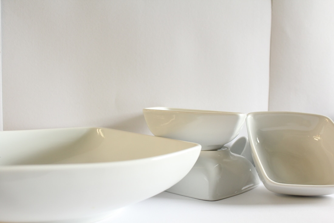
Test shoot 3 - working of the style of Artist Marcel Christ


test shoot 4


test shoot 5


test shoot 6


worst images
This is my worst image as it's underexposed or overexposed .


Best images
This is my best image because the exposure is perfect and the composition of the plates and cups links with the artist Marcel Christ this makes the picture very effective as they're not arranged perfectly which i intentionally did.


|


|


|
Test shoot- working in the style of michael mapes
Here I've went on Photoshop to crop each image to put them together like the style of Michael Mapes.
inspired picture. and my work

|

|
Plan- using cubes to make an object/Michael Mapes.
Making a house or a camera.

Plan for exam
|
|

|


|
In the Photography exam I'm going to print the photograph of my first test shoot and then I'm going to slice the black stems into shapes to make it into an illusion.
My inspiration is Justine Khamara. |

|

|
|
what I'm trying to achieve however much more bigger and more of shapes.
|


|

|
10 Hour exam WORK
|
FIRST EXAM

|

|
For the very first exam I've used my own personal pictures to create this image,which was inspired by Justine Khamara.I do this by cropping my image and putting them onto photoshop.
|

|

|
I use geometric shapes by using powerpoint to use this just like Justine does and put them on top of the layers.
|


|

|
I refine the edges of the pink circle by using the magic wand tool to make it look more professional .
|
Final image

|

|
second exam

|
|
I create my geometric shapes on powerpoint and save it as an Image.
|


|
I put the shapes on A4 white background, I again use my own images that I've taken and put it on the shape.
I do this to all of the geometric shapes making sure it fits into the shape. |


Final image

exam 3 plan


In my exam I'm going to do a shoot of faces. and use the same process as my other images to crop and merge them together.
I've took inspiration from Justine Khamara and added this into my work.
I've took inspiration from Justine Khamara and added this into my work.

|

|
Shoot for exam
Here are my images that I've taken during the exam.


|

|
Here I click distort on photoshop then waves, to make my slices in a wavy pattern.
|

|
Here I click rectangular marque tool on photoshop and select the image, I then drag the selected rectangle onto the white A4 paper and keep repeating this step until I get a face out of the picture.
|

|

|
To make the Image more interesting I decided to go on my layer and select filter and click on liquify to give that swirl effect that Justine Khamara does on her portrait pictures.
|
fINAL iMAGES
|
original pictures.

|

|
Hue/Saturated pictures.

|

|
Best FINAl pictures


evaluation
I have chosen Assembled for my exam. The theme is clothing,cosmetics,household items. Catherine losing inspired me with most of my ideas as she puts together everyday objects and rearranging them to make them appear even more interesting . I have learnt that Catherine has worked with big magazine companies such as vogue! which i found to be very incredible. Her use of pastel colours and composition helped me to put it in my work . Justine Khamara and Michael Mapes also inspired me , to cut and weave my pictures using portraits and glasses to recreate an image again. Their work inspired me to combine them both together.
I used a canon camera to photograph my images I used focus point and really good exposure to make my images come out as nice as possible. The editing software I used was Photoshop where I made my cropped slices weave together by adjusting the layers also using powerpoint to crop my images into geometric shapes. The cropping and shapes made my work more interesting and the use of pastel colours I've used. My work links with the artist as most of the inspiration and shapes, colours come from them .
I used a canon camera to photograph my images I used focus point and really good exposure to make my images come out as nice as possible. The editing software I used was Photoshop where I made my cropped slices weave together by adjusting the layers also using powerpoint to crop my images into geometric shapes. The cropping and shapes made my work more interesting and the use of pastel colours I've used. My work links with the artist as most of the inspiration and shapes, colours come from them .
